• When you click on links to various merchants on this site and make a purchase, this can result in this site earning a commission. Affiliate programs and affiliations include, but are not limited to, the eBay Partner Network.

Leather Name Tag Comparison

helodrvr

New Member
As John gets closer to prodution of my Doniger A-2, I asked him for advise on a name tag. He recommended Mash Co. So I ordered a leather name tag from them which arrived in short order. I thought some of you might be interested in seeing how their leather name tags looked as well as comparing them to one I got earlier from Split-S.

First, here is the Split-S tag:
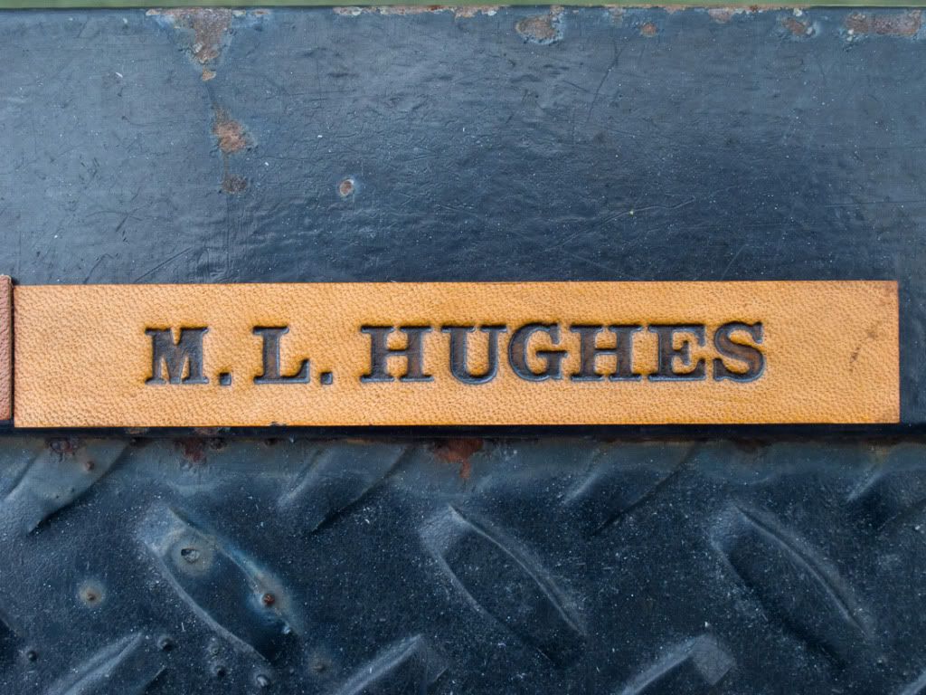
IMG_1300.jpg


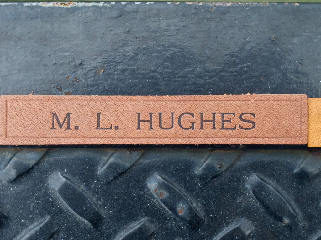
Next, the Mash Co. tag:

IMG_1299.jpg


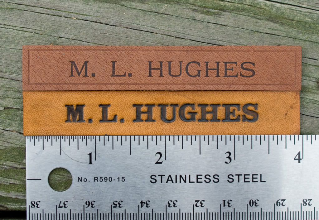
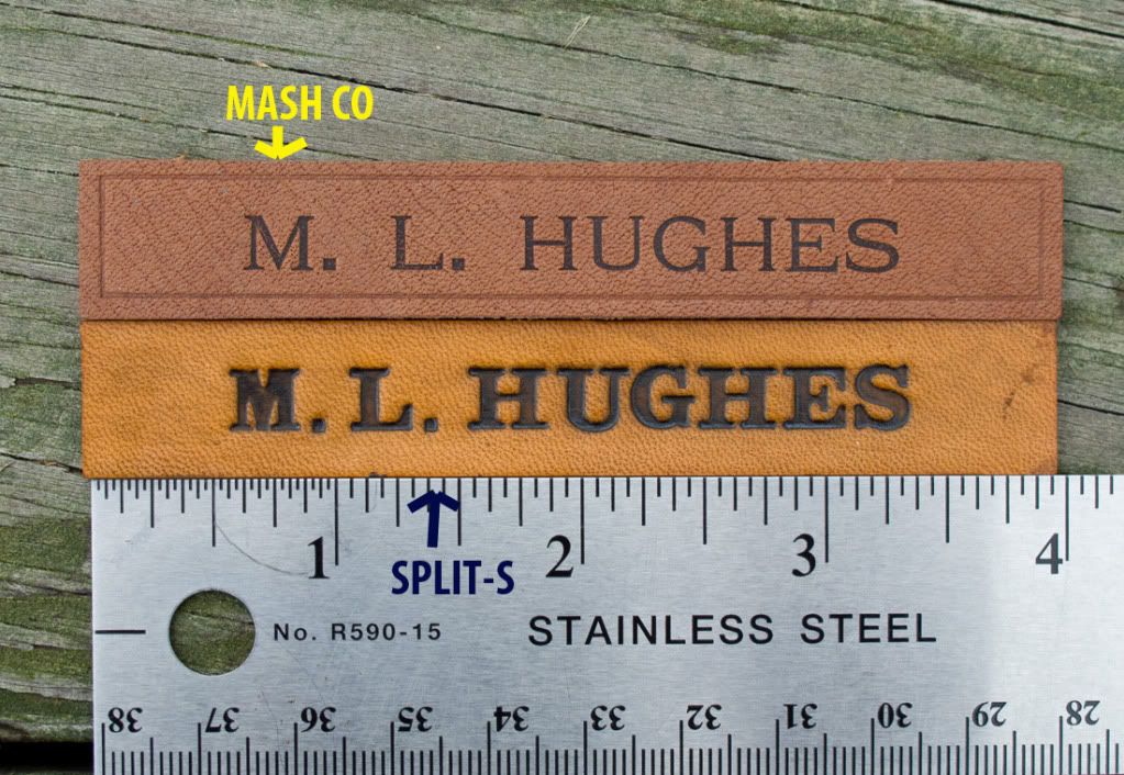
Here are the two tags together:

IMG_1296.jpg


The back sides of the two in the same positions:
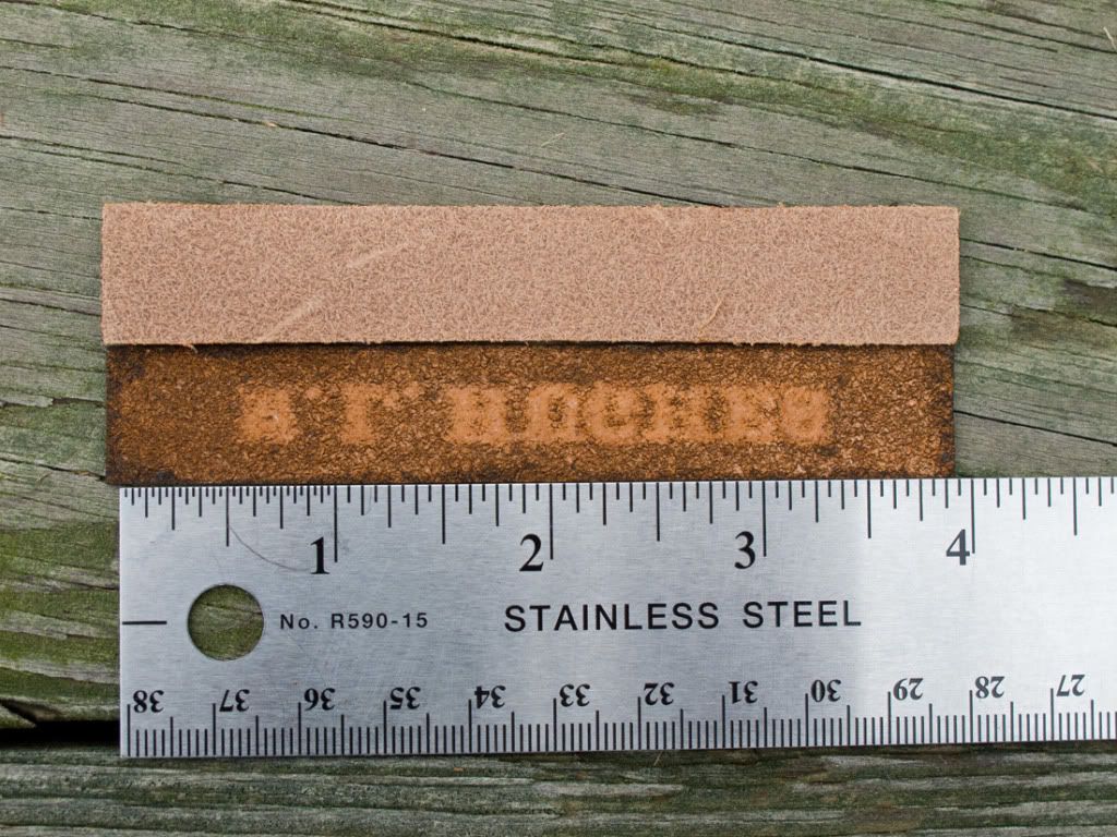
IMG_1297.jpg


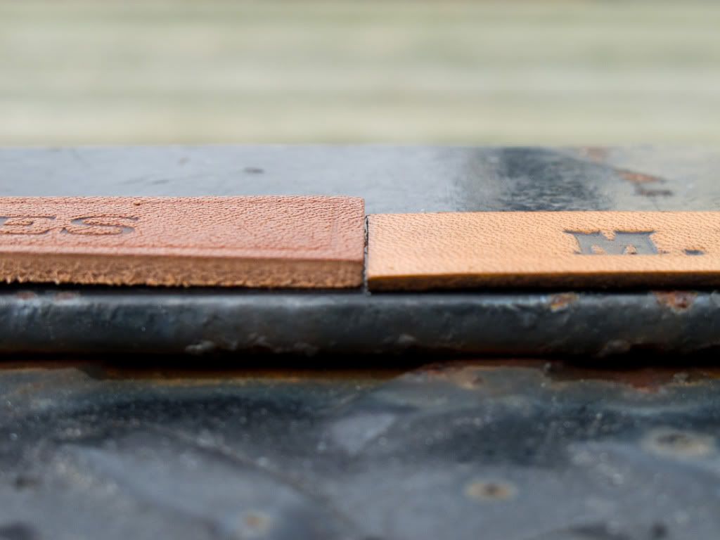
And finally, side by side:

IMG_1298.jpg


Observations:
The Mash Co. tag's printing font is more refined and subtle. Its color is much more uniform as is the embossing itself. The Mash tag is also twice the thickness with a finer exterior grain. The two tags are very different interpretations of the same item. But in reality, this is very representative of the variations I see in photos of vintage jackets with nametags. Some are crudely made and some are very finely crafted. The Mash name tag cost 2,500 yen (about $32 US including shipping.) The Split-S tag cost $8 US with another $2 for shipping.
 

dmar836

Well-Known Member
Guess I got mixed up there. Is the thicker, deeply punched one from Split S? That's what it looks like from their web page.

Dave
KC
 

helodrvr

New Member
The tag on the bottom, the lighter, more yellow colored tag with the bolder embossed letters is the Split-S tag. It is also the thinner one on the right in the side-by-side view.
 

drew parker

New Member
Hi Mel. There both nice tags. The mash seem to be a little to pristine in it's lettering. As for thickness I prefer a thin nametag. I think they are more flexible with the jacket and they also age better. Drew
 

zoomer

Well-Known Member
The Mash tag looks more like the lettering on period tags, but Drew is right, more finely done.
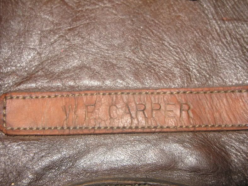
2474423498_e018879486.jpg
WW2 era tag
The Split-S tag has the look of a latter day replica made by someone who thinks "type is type."
 

dmar836

Well-Known Member
From the four examples I have, I think the Split-S looks much more authentic. Despite it's thicker leather, a whole other discussion, the MASH looks almost printed on.
JMO, I'll post some pics later.
Dave
Kansas City, USA
 

tater

New Member
The kerning is better on the split-s but the MASH font is closer (though the weight is slightly too light). The split-s font is wrong.
 

TankBuster

Active Member
I know I sound like a broken record here......but......Aero Leather name strips are the most authentic out there. Their font is dead on, as well as how it is embossed on the tag. Aero uses slightly too thick of leather cuts, but that's the only complaint I have on them.

Between the 2 posted, Split S is not even close. Mash is the better choice, but not perfect either. Of course this is all compared to original issued name strips. If that isn't a big deal, than either one will do the trick.
 

dmar836

Well-Known Member
IMG_7202.jpg

IMG_7200.jpg

IMG_7197.jpg

IMG_7203.jpg


I think the font is a little funny on the Split S but I still think it looks more authentic from a galloping horse.

JMO
Dave
KC
 

TankBuster

Active Member
Weasel_Loader said:
Period photos show so many different variations of leather tape size, style and font, how can one type be correct?

That's true. Of course there were private purchase style name strips, or theater made versions. I was referring to the name strips that were issued by the AAF like the one that Zoomer shows in this thread.
 

deeb7

Gone, but not forgotten.
dmar836 said:
I think the font is a little funny on the Split S but I still think it looks more authentic from a galloping horse.

Galloping horse, I like that ... perhaps he was on his way to the tannery. :cool:

I can't imagine ever having a name tag made, but I'd wear one if it was already on the jacket. We've discussed these name tags in the past, so if anyone wants any further info, here's one of the earlier threads ...

viewtopic.php?f=5&t=870
 

a2jacketpatches

Active Member
I have the same font as Split-S, easy enough to find if you're looking for it. However. he is able to lay it out perfectly and my tags tend to look as if they're stamped one letter at a time with a mallet (They are) I chock it up "to Theater made" They come out pretty good but not picture perfect, So I've pretty much put the name tag market behind me unless needed on one of my wing badges. All stamped tags are done on veg tanned leather, I use calf skin because it is very smooth an almost flawless, hardly any grain as the animal is so young you can hardly see pores. Most vegtable tanned leather can be sanded like balsa wood, rough to fine sandpaper will take it to any thickness you desire if it's too thick for you. Calfskin is about 1-1.5 OZ depending on what part of the hide you use, Looks like the thinner of the two examples in this thread and about as thin as you want to go. The wings below are done on the VT calfskin I mentioned, about as thick as a quarter.

I have an outline font as well, probably not dead on accurate to what anyone has ever seen, but with the variety of period examples I see here, not sure it can be completely ruled out. I'll post an example if I can find em.


wings001.jpg
 

dmar836

Well-Known Member
You'll notice also that one of those in my collection, as well as the one deand posted, were made with what appears to be the sharp metal stamps.

There really were a lot of variations in font. I agree that the letters are a bit bulbous on the one but where the letters bulge out on the sides is not the inconsistent part to me. To me, albeit a bit heavy, the Split-S looks more realistic(especially if the burnt look is gone). The MASH tag looks more like a screen print on calf or something less common.

JMO as usual,
Dave
 
Top