• When you click on links to various merchants on this site and make a purchase, this can result in this site earning a commission. Affiliate programs and affiliations include, but are not limited to, the eBay Partner Network.

ATC and 709BS patches by War Art Colours

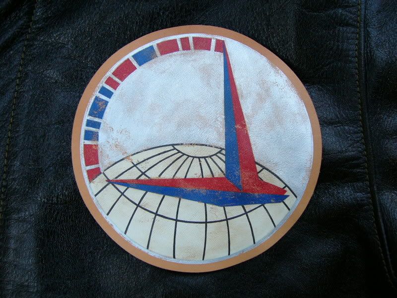
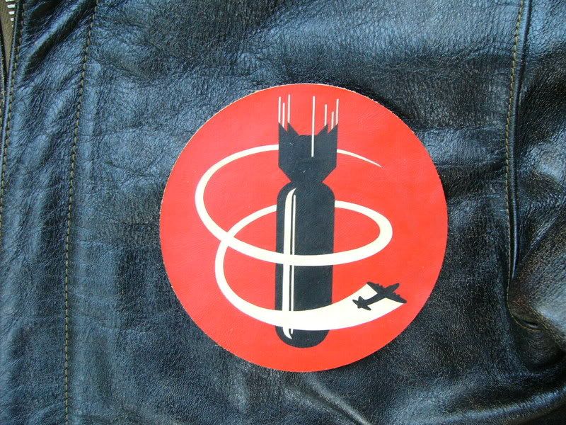
I bought both of these patches from my friend Mr. Akeno Tatsuya (War Art Colours) while in Kyoto during April for the Few trade show.

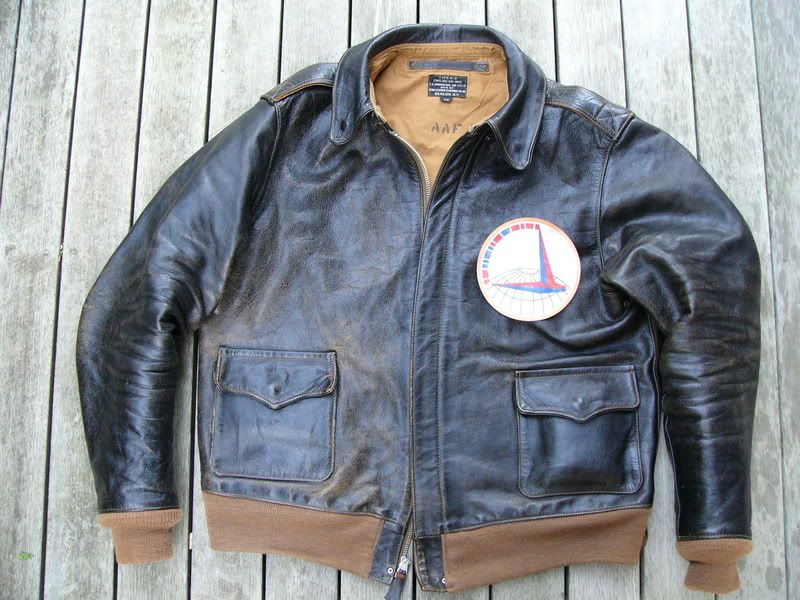
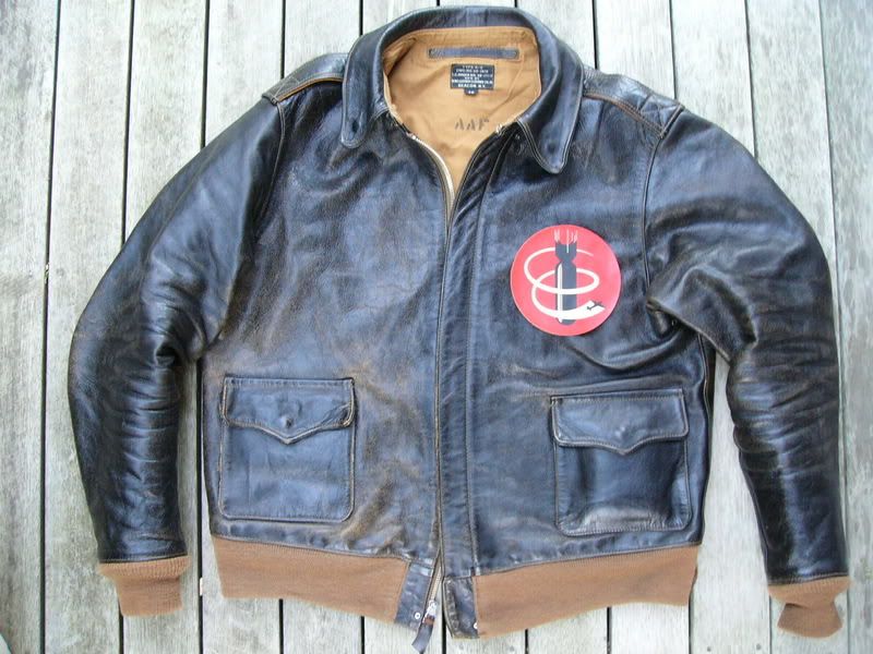
They are both laid on my Few '38 Aero for reference, I'm toying with getting the ATC patch sewn on to the jacket.

I asked him to 'age' the finish on the patch to match the worn appearance of the jacket.

P1020108.jpg

P1020110.jpg

P1020111.jpg

P1020112.jpg


BEVAN
 

deeb7

Gone, but not forgotten.
For some reason, the ATC patch looks best.

But that Aero, with the 'gently worn for two weeks' look, and the fat oversized zipper, would be my favourite jacket. And as such I would hesitate to do anything that might reduce it's wearability.

But if you think you can still wear it to church ... then go for it.

Here's the ATC patched Spiewak at Acme Depot.

http://www.acmedepot.com/a2jacket/a2ima ... k_dafb.jpg
 
deeb7 said:
But if you think you can still wear it to church ...

Ha !!

I'll see you on Sunday morning then and let me know what you reckon, bring a coin for the collection plate please,

Go in peace.

BEVAN
 

deeb7

Gone, but not forgotten.
bristolherc said:
I'll see you on Sunday morning then ...

I'll bring the pikelets ...

And if you do sew on the patch, it could do with a little more ageing first. Just a little orange shellac, and some dark wax maybe.
 

TankBuster

Active Member
I agree with the other fellow, the ATC looks better on the jacket. Normally the 709th patch was chenille, although I have also seen leather versions.
 
A

Anonymous

Guest
Love that jacket. It has 'the look'. I prefer the aged ATC, though a predominantly black and white patch might look the part on a jacket of that colour. Anyway, takes all sorts and tastes and beauty is in the eye of the beholder -you. Thanks for showing.
 

Andrew

Well-Known Member
I'd go with the 709th Bevan with a bit more roughing up, the red's a fantastic contrast to the jacket- just my opinion.
 
A

Anonymous

Guest
Leadsky said:
I'd go with the 709th Bevan with a bit more roughing up, the red's a fantastic contrast to the jacket- just my opinion.

Ya know what, you're right! The red is a nice contrast. I would take your advice over mine. Always best to have an artist judge these things.
 
Top