When you click on links to various merchants on this site and make a purchase, this can result in this site earning a commission. Affiliate programs and affiliations include, but are not limited to, the eBay Partner Network.
After looking at the three patches he had made, I would assume they were done in the colors he wanted. Although considering how far off the face of the eagle is from the design, who knows.
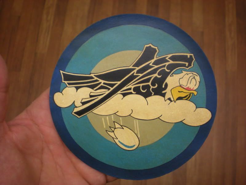
Hey Chitchat , nice job on the "recreation" of the "variation" of the 320th !!!!!!!!!!!!!!!!!
I see a few areas that you missed a little details , around the white area of the eagles head there's a thin area of "border" and the tail fins of the bomb appear to be shaded a light color ,possible light gray , Also the inner background color looks to have been a soloid overall color , but the 3 rings of color like the other 320th do look good ,other than that I think you got a good "guesstimate" of how it may have been !
I would have done one , but I have always liked to recreate a patch only if I was 100% possitive of the true colors/details , I am hoping someone will eventually find a color description of this emblem ,in the meantime your example is a good close second !!!!!!!!!!!!!
I think the original rendering was basic light and dark, maybe black and white, and was only intended as an initial design. I was looking at that as more a graphic design than the cloth patches that show shades of gray at the wing tips, Not sure how to do that kind of gray shading you speak of with very defined, and straight lines of the original draft.
I usually do it with "thinned" paint and "feather it" onto the patch , I work with acrylics so I'm not sure what you use , but I have found it works good that way .
I hope you don't think I was "critisising" your work , I meant it as just a "suggestion" the patch you made looks GREAT !!!!!!!!!!!!!!!
Usually when a drawing like that was done up it was a"Draft" like you mention, some changed thier designs quite a bit once a "patch" was made, then others followed the "original" sketch/painting to the letter , it all depended on the artist at the time mostly .............
So again your design is the most closest to what it could have been , I just wish they could ahve had a "color" noting for the design, that sure would ahve helped !!!!!!!!!!!!!!!!!!!!!!!!!!!!!!!!!!!!!!!
Keep up the great work !!!!!!!!!!!!!!!!!!!!!!!!!!!!!!!!!!!!!!
Johnny
They just re aired this program about the "originals" on the show last night , it was great to see it again as I missed the beggining of it , It is a really great thing that these were "Saved" from the dumpster as they were , Wow talk about an really "Rare" patch , like the one guy on the show said ,How many of these could still be out there , not many I'd think , and I do believe they were originally palnned as the "sqd's" true unit emblem , but the "Moby Dick" design won out , that's why there ws the full drawing in the album he showed on the program , they had to "sumbit" through channels to the higher ups a "concept" drawing to see if it would be O.K. not only wiht the immediate "unit" but also "approved " by the Upper Echelon , many weren't and some worn anyway , then others were totally rejected , I think this one ended up being made as a "Crew" patch , some unit's did this also in that era .
Mike McCune Told me he's offering his patch and some documents up for sale to anyone interested in it , it's a cool and I think VERY rare one , he can be reached if need be at